What to Wear for Photos: A Portrait Session Clothing Guide
posted on
June 2, 2026
Now the fun part begins — choosing outfits for your portrait session in Chicago. If you’re wondering what to wear for photos, you’re not alone. Clothing plays a huge role in how your final images feel and can elevate a portrait from beautiful to truly timeless.
Well-coordinated outfits help ensure your portraits feel just as meaningful years from now as they do today. I know styling can feel overwhelming, which is exactly why I guide every client through the process. I offer pre-session support and in-person or virtual consultations where we can go through your wardrobe together and build outfits that photograph beautifully and feel like you. You can see examples of these styling choices throughout my family, newborn, and milestone galleries.
How to Coordinate Outfits for a Portrait Session
One of the most important styling rules is simple: coordinate, don’t match. Instead of everyone wearing the same color or outfit, we build a palette of tones that work together naturally. A great place to start is choosing two main colors, then layering in different shades, textures, and neutrals. If you feel like something is missing, a third accent color can be added — but I recommend keeping it subtle through accessories or small details rather than full outfits.
A helpful strategy I often use is starting with the most difficult person (or outfit) first. Once that piece is chosen, everything else naturally falls into place around it.
Color Palette Inspiration for Your Portrait Session
One of the most common questions I receive before a portrait session is, “What colors photograph best together?”
The answer is simple: coordinate, don’t match.
Rather than dressing everyone in the same color, choose a palette and mix different shades, textures, and layers. This creates depth, visual interest, and timeless portraits that feel natural and connected.
Below are a few of my favorite portrait-friendly color palettes, along with real client examples showing how these color combinations come together beautifully. These aren’t strict rules—simply inspiration to help you visualize how different color combinations can work together beautifully in portraits.
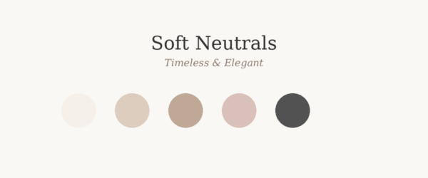
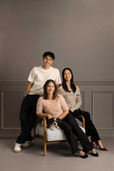
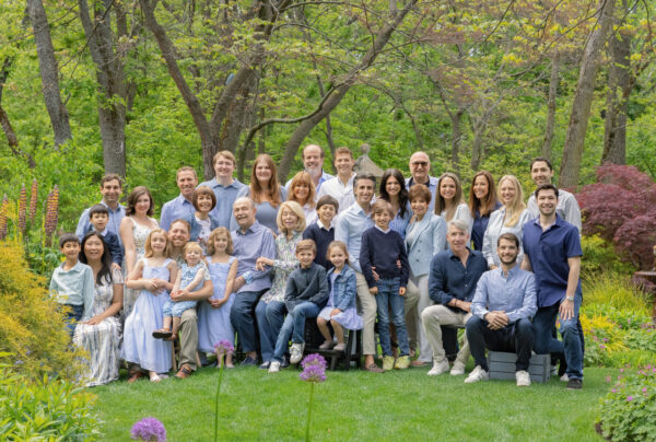
Soft neutrals create an elegant and timeless look that never feels trendy or dated. By combining light, airy tones with a touch of contrast, families create visual depth while keeping the focus on connection and expression.
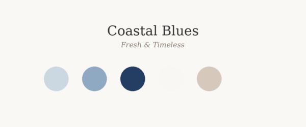
Coastal Blues
Powder Blue • French Blue • Navy • White • Light Beige
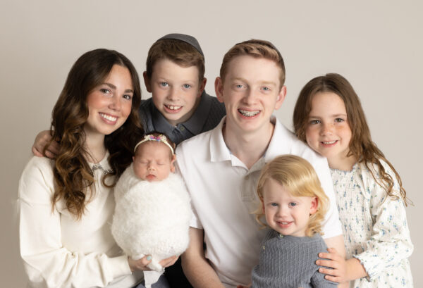
Blue is one of the easiest colors to coordinate across multiple generations. Mixing lighter and darker shades creates a cohesive look without appearing overly matched, while soft neutrals keep the overall palette fresh and timeless. This combination photographs beautifully outdoors and is especially popular for extended family portraits.
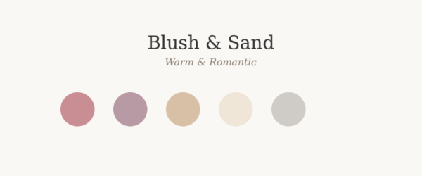
Blush & Sand
Dusty Rose • Mauve • Sand • Cream • Soft Gray
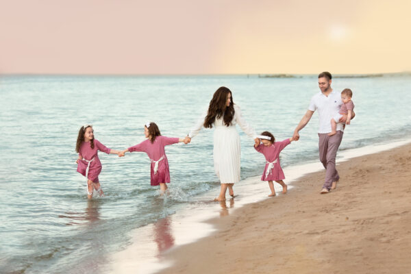
Blush tones paired with warm neutrals create a soft, romantic aesthetic that photographs beautifully during golden hour. The result feels feminine, sophisticated, and timeless while still maintaining a natural, effortless look. This palette is especially beautiful for beach portraits, maternity sessions, and family photography at sunset.
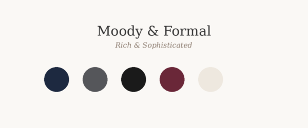
Moody & Formal
Midnight Navy • Charcoal • Black • Burgundy • Warm Ivory
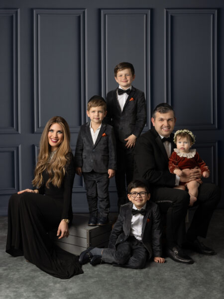
For a more dramatic and refined portrait style, deeper tones create beautiful depth and sophistication. Rich colors such as navy, charcoal, and burgundy photograph elegantly while maintaining a polished and cohesive appearance. This palette is ideal for studio portraits and families looking for a more formal, luxury-inspired look.
Country Chic
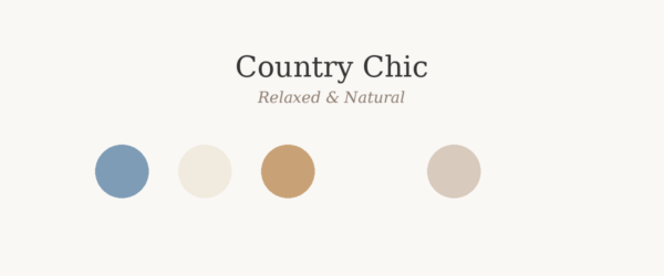
Denim • Cream • Camel • Soft White • Warm Beige
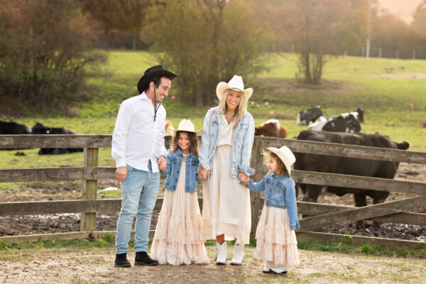
Denim paired with soft neutrals creates a relaxed, natural feel while still looking thoughtfully styled. The combination of textures and earthy tones adds warmth and visual interest without overwhelming the image. This palette is perfect for outdoor family sessions and rustic settings.
Once we’ve chosen a color palette that feels like you, the next step is making sure your portraits complement the space where they’ll ultimately be displayed.
Styling Your Portraits With Your Home in Mind
What to Wear for Photos That Matches Your Home Decor
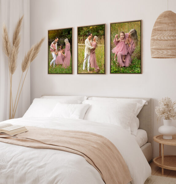
One of the most important parts of your design consultation goes beyond just choosing outfits — we also consider how your portraits will live in your home. For example, if your home is light, neutral, and airy, we avoid overly bold or neon tones and instead focus on soft, timeless palettes like blush, cream, soft blue, and earthy greens.
How What You Wear Affects Your Wall Art
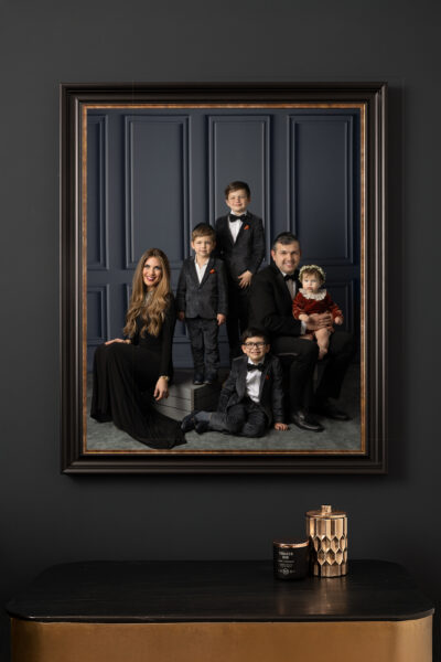
When your wardrobe and home design work together, your portraits feel cohesive and intentional — making them something you’ll actually want to display, not store away digitally. If you do not have an in-home consultation, I often encourage clients to share photos of their home so we can thoughtfully design a session that translates beautifully into wall art.
From Session to Wall Art: Designing Your Home Gallery
Seeing Your Portraits as Art, Not Just Photos
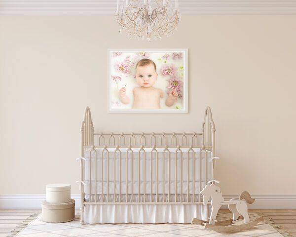
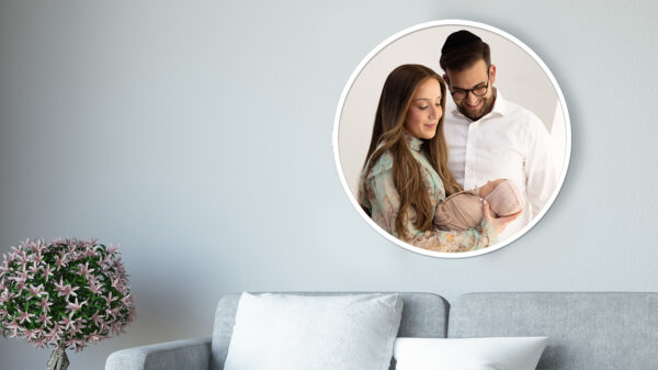
Your images are created with your home in mind so they naturally become part of your space — whether above a sofa, in a nursery, or a hallway gallery wall. When styling, lighting, and home decor align, your gallery feels timeless, intentional, and deeply personal.
Real Client Homes & Artwork Installations
You can see how each client’s wardrobe and backdrop choices were intentionally designed to complement their home decor. The result is artwork that feels at home in their space—pieces they’re excited to display and see every day.
Interior of nursery. Frame mockup. 3d render.
Mockup frame in bedroom interior background, room in light pastel colors, 3d render
Black picture frame in living room with sofa
Meaningful Clothing Choices for Your Portrait Session
Once your base outfits are selected, we bring everything to life with layers and texture.
These small details make a huge difference in portraits:
cozy cardigans and sweaters
linen or cotton textures
flowy dresses or tailored pieces
hats, hair accessories, or subtle jewelry
scarves or lightweight layering pieces
These elements add depth, movement, and visual interest without overwhelming the image. Many clients also create inspiration boards on Pinterest before their session to save outfit ideas, color combinations, and styling inspiration that reflects their personal style.
Sentimental Outfits & Meaningful Details
Some of the most meaningful portraits come from clothing that carries personal history.
Sentimental outfits — whether it’s a handmade heirloom piece, a gifted outfit, or something passed down through generations — always add an emotional layer to your images that cannot be recreated.
I once had a client come in for first birthday portraits for her daughter and she brought the dress she herself wore at her own first birthday. It was such a powerful, full-circle moment — seeing that piece of her own childhood brought back into new memories for her daughter. Those are the kinds of details that make portraits truly unforgettable.
If you have something meaningful like this, I always encourage you to bring it. These pieces don’t just photograph beautifully — they help tell your family’s story in a deeply personal way.
What to Remember Before Your Session
A few small details can make a big difference in how polished your final gallery feels:
Please iron or steam outfits before your session
Shoes may be visible, so avoid flip flops, Crocs, or overly casual footwear
Socks can show depending on posing, so choose intentionally
Wear clothing that is comfortable and season-appropriate
Make sure everything fits well (nothing too tight or overly oversized)
Clean, trimmed nails are important for close-up portraits (manicures are optional but always beautiful)
These simple steps help ensure every detail in your portraits feels intentional and timeless.
What to Avoid Wearing to Your Portrait Session
There are a few styling choices I recommend avoiding to keep the focus on connection and expression:
large, bold patterns that compete for attention
multiple people wearing busy prints at the same time
thin, tight stripes that can create a distorted “moiré” effect in photos
neon or overly bright colors that overpower skin tones
The goal is always for you to stand out — not your clothing.
I also recommend avoiding strong sun exposure or tanning right before your session, as this can sometimes create uneven tones in photographs.
My Role in Styling Your Session
Styling is never something you have to figure out alone.
Once we’ve selected your outfits, I carefully lay everything out together to ensure the colors, textures, and tones work cohesively. I evaluate how everything photographs as a complete story — not just individual outfits.
If everything flows beautifully, we’re ready for your session knowing that every detail has been thoughtfully prepared.
Final Thoughts on What to Wear for Photos
What to wear for a portrait session can be stressful. Remember- the best outfits are the ones that feel like you — just elevated.
When your clothing is cohesive, simple, and thoughtfully chosen, your portraits naturally become more timeless, emotional, and focused on what truly matters: connection and expression.
View More & Inquire
If you’re planning your own portrait session in Chicago, I’d love to help you create images that feel natural, elevated, and beautifully styled from start to finish.